How To: Snap-to Alignment Options in Spider Impact
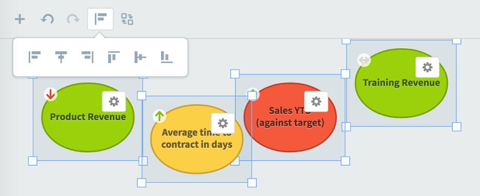
In this second article in our "how to" dashboard series, we will cover how to use the snap-to alignment options in Spider Impact.
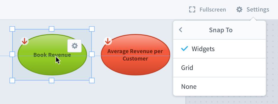
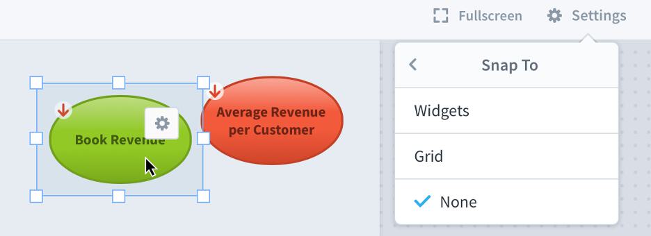
There are now three different snap-to options when editing dashboards. The default option is Snap-to Widgets, which uses the size and position of other widgets on the dashboard as a guide as you’re moving or resizing widgets.
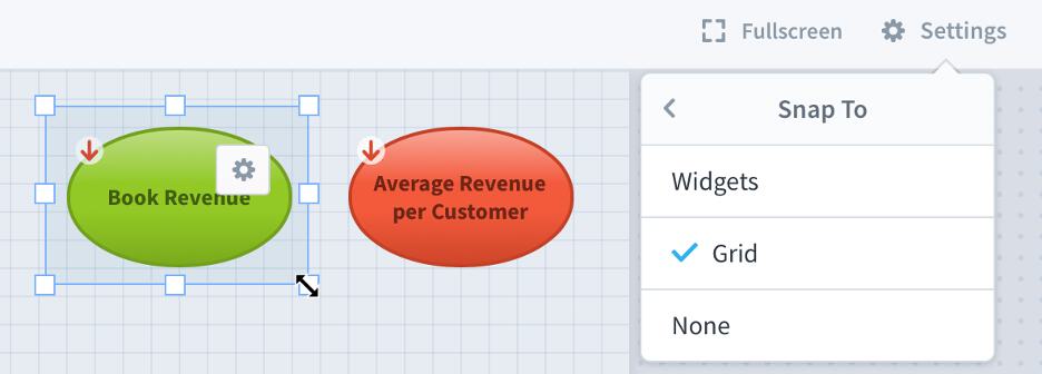
Another option is Snap-to Grid, which aligns your widget position and size to a grid that only shows up when you’re editing.
Finally, you can choose Snap-to None, which disables snapping all together. This is useful when fine-tuning layouts or when there are widgets that are irregularly placed.
Snap-to widget spacing
When you’re editing your dashboard in Snap-to Widgets mode (the default), Spider Impact now makes it easy to maintain uniform spacing between widgets.

Just drag your widget close to other widgets and it will snap into place.

Snap-to spacing and alignment automatically combine for perfect positioning.

Stay tuned for next week's article, where we’ll cover shared dashboard images.
Interested in Experiencing Spider Impact for Yourself?
Request a Self-Guided Free Trial or a Live Demo.
Demo then Free Trial
Schedule a personalized tour of Spider Impact, then start your free 30-day trial with your data.


