KPI Reports 101: What to Include and How to Visualize Performance

You've collected mountains of performance data, but your KPI reports still don't drive the strategic decisions your organization needs. This frustrating reality affects countless teams who spend hours creating impressive-looking reports that collect dust instead of inspiring action.
Raw numbers pile up faster than you can transform them into meaningful guidance, and most organizations find themselves producing static reports that become outdated before stakeholders can act on them.
This guide provides a strategic framework for building KPI reports that bridge the gap between raw data and decisive action, transforming your reporting process from an administrative burden into a competitive advantage.
What You'll Learn
You'll discover how to connect your KPI reports directly to organizational objectives, choose the right visualizations to accelerate decision-making, customize reports for different stakeholders, and automate data collection to free your team for strategic analysis.
Essential Components of Effective KPI Reports
Performance reports that drive strategic action require more than accurate numbers—they need structure that transforms raw data into actionable intelligence. Many organizations produce data-rich documents that fail to connect metrics to meaningful business outcomes, leaving leaders with information but no clear direction for improvement.
To avoid that trap, your KPI reports need a clear structure that connects performance data to real decisions.
In the next section, we break down the essential components that turn reporting into guidance—so leaders can move from reviewing numbers to driving outcomes.
Component 1: Strategic Alignment
Every metric in your KPI report should connect directly to your organization's goals and strategic objectives. Without this strategic context, even the most accurate performance data becomes meaningless noise.
Research shows that two-thirds to three-quarters of organizations struggle to execute their strategy successfully — making strong performance systems a must.
The strategic planning process helps keep every part of your organization working toward the same goals and ensures optimal resource allocation. When teams see how their performance contributes to broader organizational outcomes, they become more engaged and focused on driving results that matter.
Component 2: Defined Targets and Thresholds
Effective KPI reports establish clear performance standards through well-defined targets and intervention thresholds. Each metric should include current values alongside target ranges, making it immediately apparent whether performance stays on track, approaches concern levels, or requires immediate attention.
You need to know not just where you stand, but where you need to be and how far you have to go. KPI development requires documenting the details of the measure so that it stays consistently calculated and presented from reporting period to reporting period, allowing for more meaningful performance analysis and conclusions.
When you combine strategic alignment with clear targets, trend analysis, and actionable insights, you create a reporting system that does more than inform—it inspires action.
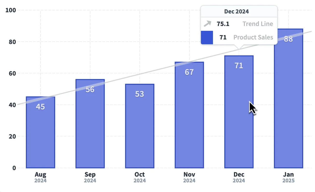
Component 3: Trend Analysis and Comparative Context
Historical performance data reveals patterns, seasonal variations, and trajectory insights that single-point measurements miss entirely. By presenting performance over time alongside relevant benchmarks, reports help you distinguish between temporary fluctuations and meaningful trends that require strategic response.
These comparisons might include year-over-year analysis, industry standards, or performance relative to similar organizational units. This comparative context provides the perspective necessary for informed decision-making and realistic goal setting.
Component 4: Actionable Insights and Recommendations
The most valuable KPI reports conclude with clear recommendations that guide immediate next steps. Rather than simply presenting data, effective reports synthesize information into specific interventions, highlight priority areas, and suggest concrete actions.
These essential components create the foundation for reports that actually influence behavior and drive improvement. The next step involves presenting this carefully structured information through visualization choices that enhance comprehension and accelerate decision-making.
Putting It All Together
Combine strategic alignment, clear targets, trend context, and actionable insights, and your KPI reports transform from static documents into decision-driving tools. Leaders see what matters most, teams understand their impact, and your organization can act confidently on opportunities and challenges. When structured this way, reporting moves from passive tracking to proactive performance management.
With these core components in place, the next step is presenting your data in a way that’s easy to understand and act on. Even the best-structured KPI reports can fall flat if the visuals don’t clearly communicate performance.
The following section outlines visualization best practices that turn numbers into insights, enabling faster, more confident decision-making.
Visualization Best Practices for KPI Reports
Poor visualization choices can turn even the most comprehensive performance data into useless noise. When you match data presentation to decision-making needs, you can process complex information instantly and respond with strategic confidence.
Quick Reference: Chart Types at a Glance
Time-series data → Line charts show trajectory and momentum
Comparing performance → Horizontal bar charts provide instant visual ranking
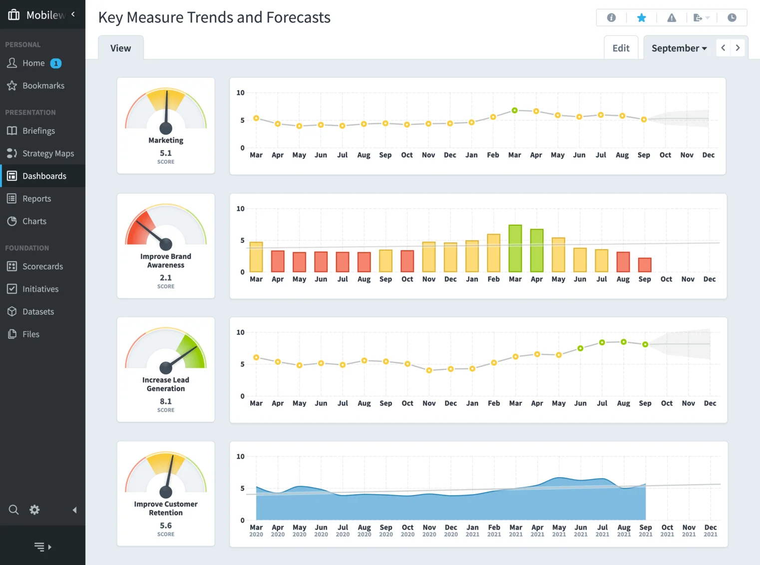
Progress to goal → Gauge charts or progress bars show completion status
Complex patterns → Heat maps and scatter plots reveal underlying trends
Select a Chart That Matches Your Message
Pick chart types that tell the story your data needs to convey and fit how your audience makes decisions. For executives, simple, high-level charts that show status at a glance work best. For operational teams, more detailed visuals like scatter plots or heat maps can uncover patterns that drive tactical decisions.
The trick is to match the complexity of your charts to your audience.
What helps your finance team dig into the numbers might feel overwhelming to sales leaders—so tailor your visuals to make insights clear and actionable for each group.
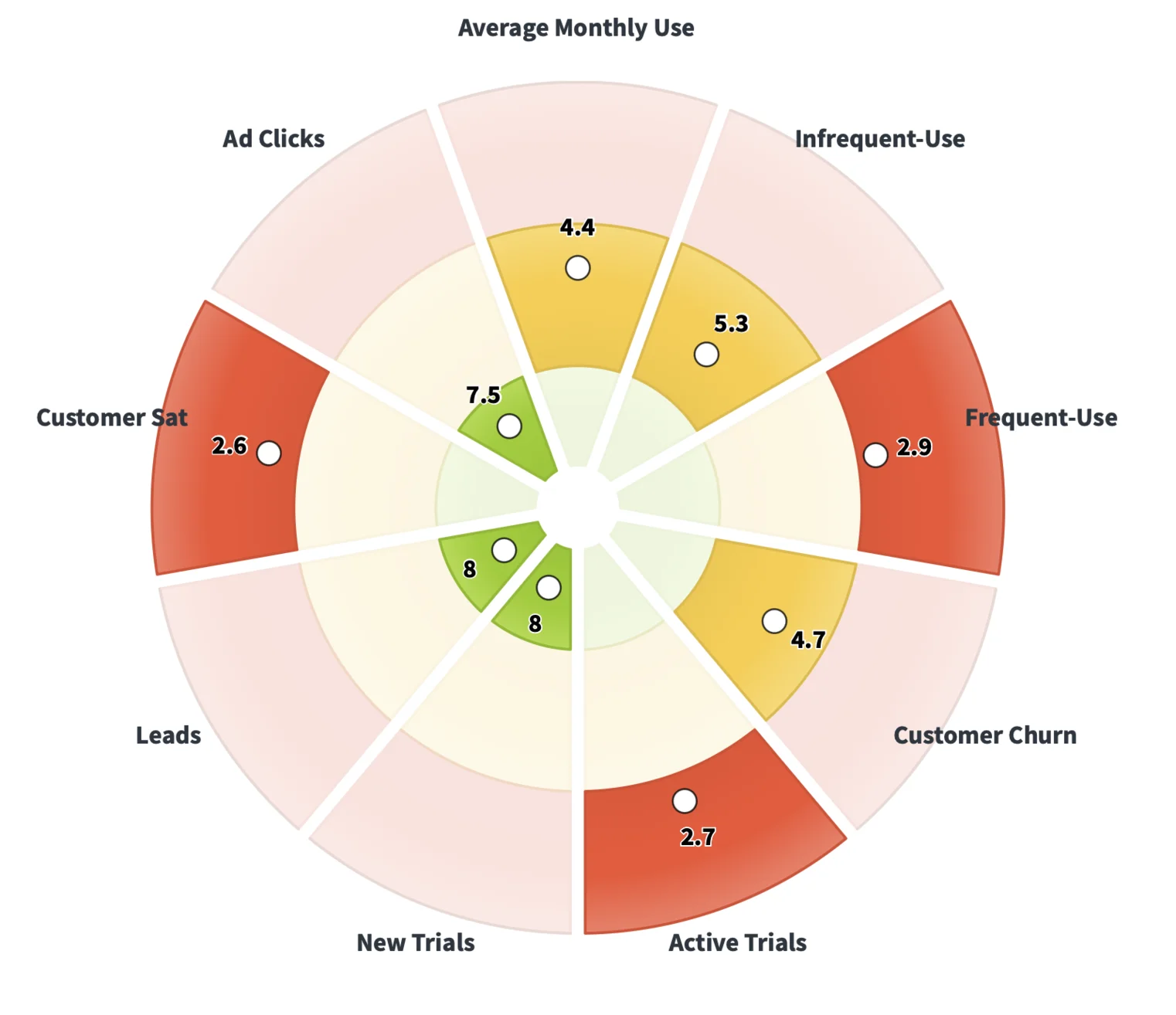
Use Color Coding to Communicate Status Instantly
Using color strategically can turn your reports from just data into real decision-making tools. Set up a consistent color language:
- Red for urgent issues
- Yellow for areas to watch
- Green when targets are on track
This “traffic light” approach helps busy executives spot priorities in seconds. You can take it further by using shades—darker reds for serious underperformance, lighter reds for minor deviations—so your audience can instantly see not just where attention is needed, but how much.
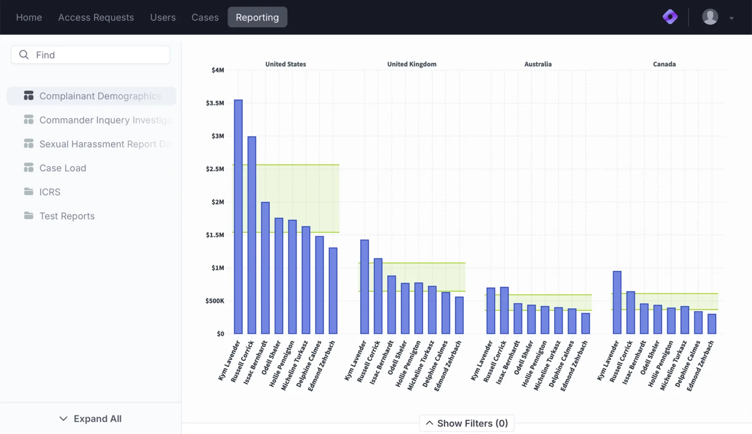
Use Interactive Dashboards and Drill-Downs to Understand Your Data
A well-designed dashboard leads users through the data in a clear, logical way while giving them the tools to dig deeper. Put the most important KPIs front and center, using size, spacing, and layout to draw attention.
At the same time, include interactive elements, like those available in Spider Impact's Briefings module, so leaders can explore the details behind the numbers whenever they need to.
Design a cohesive, interactive dashboard experience by:
- Logically grouping interconnected metrics
- Spotlighting critical data for quick navigation
- Incorporating drill-downs and tools like Spider Impact Briefings to explore context behind the numbers
- Maintaining clean simplicity while offering depth for analysis
Interactive visualization transforms raw data into actionable insights. Drill-downs allow teams to move beyond surface-level numbers to understand the “why” behind trends, uncover anomalies, and identify opportunities—all without switching between reports or applications.
By centralizing data and providing interactive capabilities, dashboards not only show performance but make it understandable. Teams can make faster, evidence-driven decisions, reduce reliance on intuition, and act with confidence on strategic priorities.
With these principles in place, your dashboards will do more than display KPIs—they’ll enable informed decision-making at every level, all while reducing manual reporting effort.
Automation and Efficiency in KPI Reporting
Many teams waste crucial time on routine data tasks that could be automated. While they format spreadsheets and hunt for information, competitors analyze insights and adjust strategies.
Here are just some reasons to automate your KPI reporting:
Reason 1: Stop the Data Hunt
Automated data collection eliminates the tedious hunt for information across multiple sources. Nearly 70% of workers say automation's biggest opportunity lies in reducing time wasted on repetitive work, with 55% specifically citing data collection as a productivity killer.
Modern reporting solutions connect directly to your existing systems, whether your performance data lives in spreadsheets, databases, ERP systems, or web applications. Scheduled imports keep your KPIs current without manual intervention while solving version control issues that plague manual processes.
Reason 2: Transform Fragmented Data Into Comprehensive Insights
System integration transforms fragmented data into the complete picture you need. Exploring data automation techniques simplifies importing data into your reporting systems while enabling advanced calculations that use functions and formulas for more sophisticated performance metrics.
You can schedule reports to reach stakeholders exactly when they need them—whether executives need weekly summaries, department heads require daily operational updates, or board members want quarterly strategic overviews.
Reason 3: Reduce Errors and See Data in Real-Time
Error reduction extends far beyond simple time savings. Manual data entry introduces inconsistencies, transcription errors, and outdated information that can lead to misguided strategic decisions.
Automation—especially AI-powered automation, like what Spider Impact offers—can significantly reduce the repetitive, manual work that finance teams spend on reporting and planning. According to The CFO, AI could save FP&A professionals 50–200 hours annually by automating routine financial tasks.
By automating data collection, normalization, and reporting, you can also strengthen data integrity: consistent formatting, standardized calculations, and unified data sources ensure everyone is working from the same accurate, trustworthy information.
With data compilation handled systematically, your team can redirect their expertise toward analyzing trends, identifying opportunities, and developing action plans that drive meaningful performance improvements.
Common Mistakes to Avoid in KPI Reporting
Performance reporting failures cost organizations millions in missed opportunities and misdirected resources. Most of these costly mistakes stem from three fundamental errors.
Mistake #1: Information Overload
When you include every available metric without clear prioritization, you'll paralyze decision-makers with choice rather than empowering them to act. Your brain can only process limited information effectively, so reports packed with excessive metrics get scanned quickly rather than analyzed thoroughly.
While many companies highlight operational efficiency as a top value driver, they rarely back it up with performance metrics. In fact, a KPMG survey found that although 66% of organizations rank operational efficiency among their top three value drivers, only 21% actually report related KPIs.
This gap underscores the need for stronger performance systems that tie strategic value to measurable outcomes.
Mistake #2: Missing Strategic Context
When your KPI reports present performance data in isolation without connecting metrics to broader organizational objectives, you'll trigger misaligned actions. Teams may optimize for indicators that appear problematic in isolation but actually represent acceptable trade-offs within the larger strategic framework.
Understanding KPI, metric, and measure differences becomes crucial here—while all key performance indicators (KPIs) count as metrics, not all metrics qualify as KPIs. The distinction lies in alignment with strategic business goals.
Mistake #3: Poor Visualization Choices
Complex charts that require extensive interpretation, inconsistent color schemes that confuse rather than clarify, and overwhelming dashboards that lack visual hierarchy all contribute to reports that obscure rather than illuminate performance patterns.
Organizations often struggle with KPI implementation challenges including measuring what's easy rather than what's important, misaligned or conflicting metrics, information overload with no insight, and lack of accountability with unclear ownership.
Mistake #4: Relying on Static, Outdated Data
Reports that rely on snapshots of past performance can quickly become obsolete, leading teams to make decisions based on yesterday’s information. Static data obscures emerging trends, hides early warning signals, and prevents proactive course corrections.
Automated, real-time reporting solves for this by continuously collecting, aggregating, and analyzing data. With this, teams and organizations can monitor KPIs as they evolve, spot deviations instantly, and respond with confidence. Tools like Spider Impact streamline this process, combining automated data integration with intuitive dashboards so your teams always act on the most current, accurate information.
Avoiding these critical mistakes transforms your valuable strategic intelligence into clear guidance that drives meaningful performance improvements.
Take Action Today: Three Steps to Better KPI Reports
Ready to transform your KPI reporting? Here's how to start:
1. Audit your current reports. Review your last three KPI reports and identify: Which metrics don't connect to strategic objectives? Where are decision-makers confused? What data takes longest to compile?
2. Start with one high-impact improvement. Don't try to fix everything at once. Choose either automation, better visualization, or strategic alignment as your first focus area.
3. Test and iterate. Share revised reports with a small group of stakeholders, gather feedback, and refine before rolling out organization-wide.
The most successful organizations recognize that powerful KPI reports emerge from strategically combining relevant content, compelling visualizations, and intelligent automation. When these elements work together seamlessly, your reports become catalysts for performance improvement rather than static documents.
Elevate Your KPI Reporting with Spider Impact
Spider Impact transforms KPI reporting from time-consuming manual work into strategic decision-making tools. Our platform automates data collection and creates dynamic, interactive presentations and visualizations that keep your team focused on results.
You'll eliminate tedious report creation while delivering the insights your organization needs to achieve strategic goals.
Schedule a demo today and discover how Spider Impact can revolutionize your performance reporting approach.
Frequently Asked Questions
What makes a KPI report effective versus just informational?
An effective KPI report goes beyond presenting data to drive strategic action. It connects metrics directly to organizational objectives, includes clear targets and thresholds, provides historical context for trend analysis, and concludes with specific recommendations for next steps. Informational reports simply display numbers, while effective reports transform data into strategic intelligence that guides decision-making and inspires focused action across the organization.
How often should KPI reports be generated and distributed?
KPI report frequency should align with decision-making cycles and the nature of your metrics. Executive leadership typically needs weekly summaries and quarterly strategic overviews, while operational teams may require daily updates for tactical adjustments. The key is matching reporting cadence to how quickly performance can change and how frequently stakeholders need information to make informed decisions. Automated systems can accommodate multiple frequencies simultaneously.
What's the ideal number of KPIs to include in a single report?
The optimal number of KPIs depends on your audience and purpose, but generally follows the "7±2 rule" from cognitive psychology - most people can effectively process 5-9 items simultaneously. Executive dashboards should focus on 3-5 critical metrics, while operational reports can include 7-10 related indicators. The key is prioritizing metrics that directly connect to strategic objectives rather than including every available data point, which creates information overload and dilutes focus.
How do you choose the right chart types for different KPI data?
Chart selection should match your data's story and your audience's decision-making needs. Use line charts for time-series data showing trends and momentum, horizontal bar charts for comparing performance across departments or regions, and gauge charts for progress toward targets. Executive audiences benefit from simplified visualizations that communicate status instantly, while operational teams may need more detailed charts like scatter plots or heat maps that reveal underlying patterns requiring tactical response.
What are the most common automation opportunities in KPI reporting?
The biggest automation opportunities include data collection from multiple sources, scheduled report generation and distribution, real-time dashboard updates, and alert systems for performance thresholds. Modern reporting solutions can connect directly to existing systems like spreadsheets, databases, ERP systems, and web applications to eliminate manual data entry. This automation reduces errors by 37% and improves productivity by 33%, while freeing teams to focus on analysis and strategic response rather than administrative tasks.


Demo then Free Trial
Schedule a personalized tour of Spider Impact, then start your free 30-day trial with your data.