Design Advice - Look and Feel
Note: An old college friend recently asked me to critique the design of one of his web projects. I thought some of my advice might be helpful to web developers in general, though, so I'm publishing a few excerpts here.
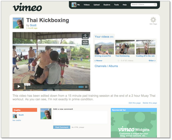
Color scheme and aesthetic choices are some of the more subtle design decisions, but they go a long way towards improving site usability. Take the video sharing site, Vimeo, for example. Zach Klein, one of my favorite designers, is largely responsible for its look and feel, and he’s done a great job creating a site that just seems easy. Don’t confuse good design with simplicity, though. A lot of effort has gone into making this page look clean.

My first piece of advice is to not be afraid of white space. There’s absolutely nothing wrong with having sections of the page empty if everything is laid out well. This took me a very long time to learn.
Less is better. Our mission as web designers is to put as little information on the page as possible to accomplish what needs to be done. Not only does this apply to layout, but also functionality. The guys at 37 Signals say that the mark of a good developer is the ability to say “no” to the majority of requests for new stuff. If you haven’t read their book I highly recommend it.
Avoid using black text, or black anything for that matter. It’s jarring and super high-contrast. Instead, use a slightly faded version of black, which will look pretty much the same but with a subtly smooth appearance. You’ll also have 100% black in your arsenal to use when you really want to draw attention to something. I’ll bet you didn’t notice that this text is dark gray until just now.
This concept goes for everything, actually. If you’re writing white text on a baby blue background, throw a little blue into the white. I like to think of everything as being 90% opaque. Photoshop helps a ton in this area.
Finally, use large fonts when appropriate. Sure, you’re going to want some text smaller, but a nice size 20 Helvetica/Arial font really lets people know what page they’re on. I prefer sans-serif fonts.
Demo then Free Trial
Schedule a personalized tour of Spider Impact, then start your free 30-day trial with your data.


